Case study Dobrá Vinice
What we were
responsible for
![]() The brand’s strategy
The brand’s strategy
![]() Communication strategy
Communication strategy
![]() Branding & design
Branding & design
![]() Website & e-store creation
Website & e-store creation
![]() Advertising (PPC advertising, emailing)
Advertising (PPC advertising, emailing)
What we achieved
higher website traffic
average time spent on the website
%
average email open rate
%
average email CTR
Client
references
‘The young, dynamic Kreema and its team of professionals perfectly understood the concept of Dobrá Vinice and are managing to meet our requirements to our great satisfaction.’
Andrea Nejedlíková, CEO & Viticulturist at Dobrá Vinice

Dobrá Vinice is a biodynamic winery that is not afraid to do things differently in its own way, while also standing on a solid foundation of 30 years of experience.
The brand was intuitively unique from the start, which helped it gain a strong position in the Czech market during its existence. However, it was necessary to anchor the core of the brand and its strategic direction in order to make it consistent and understandable for its consumers. It was equally important to make the unique wine of Dobrá Vinice more accessible to consumers through convenient purchasing directly from the winery, and to establish direct contact with them.
The brand’s strategy
& communication strategy
Like the wine, the brand was created intuitively and with heart throughout its existence, which is unmistakably reflected in its personality. It was our aim to preserve this personal touch while figuring out the primary target group based on a situation analysis and defining the key values of the brand and its strategic direction. We didn’t want who the brand is speaking to and what it is saying to change as frequently as our mood.
We projected the winery’s unique aspects into the brand’s strategy and communication – the vineyard is located in the Podyjí National Park, it uses technologies inspired by traditions (qvevri = an 8,000-year-old wine production method), the whole wine production process (from vineyard to cellar) is natural, and it is also one of few wineries that offer archive wines.
We have defined the rebel archetype for the brand, which perfectly reflects its personality. Dobrá Vinice is characterised by challenging the status quo and breaking established rules, which is reflected in the visual identity of the communication in terms of content and its tonality.
The communication strategy, including the four communication pillars of the brand, are in line with its unique aspects and the pioneering and ecologically oriented spirit of the winery:
![]() Its own path – it’s not afraid to do things differently and discover new methods, as well as rediscover methods that are no longer used
Its own path – it’s not afraid to do things differently and discover new methods, as well as rediscover methods that are no longer used
![]() Respecting wine and nature – biodynamic viticulture follows the lunar cycle and uses environment-friendly processes
Respecting wine and nature – biodynamic viticulture follows the lunar cycle and uses environment-friendly processes
![]() Natural wine – the production process from the vineyard to your table is completely chemical-free
Natural wine – the production process from the vineyard to your table is completely chemical-free
![]() With all our heart and worn hands – the wine tells our story
With all our heart and worn hands – the wine tells our story
Visual
identity
We can see a game of contrasts in the visual identity
The font created from the winemaker’s handwriting complements the classic serif font, the graphics are based on colour contrast.
We kept the typical grape in the new logo of Dobrá Vinice, but we redesigned it in a modern, fun way.
Another strong element in the visual identity is a new font created by us, which is also used in the logo in addition to text on the website. Dobrá Vinice is a natural winery where wine is made authentically, without foreign interventions from start to finish. This should be reflected in its visual presentation. This is why we created a new unique font using the viticulturist’s handwriting scanned letter by letter, character by character.
Packaging
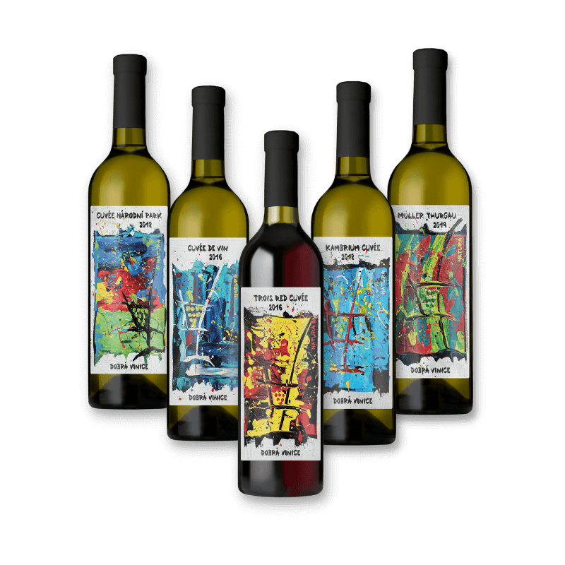
Just as the technology used by the winery is different, we also wanted to set the wine apart from other wines on the shelves in shops. We collaborated with a young artist who painted pictures that were subsequently used for the labels on the Natura line of wines.
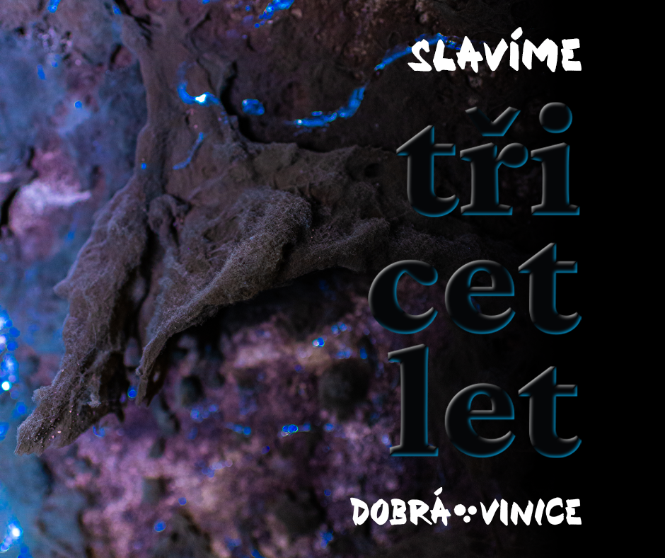
The label for the 30th anniversary of Dobrá Vinice was created in the same way. We invited a photographer, and her original detail photographs from the cellar were used for this label. It will also be used for the labels of limited lines of wine in the future.
E-shop
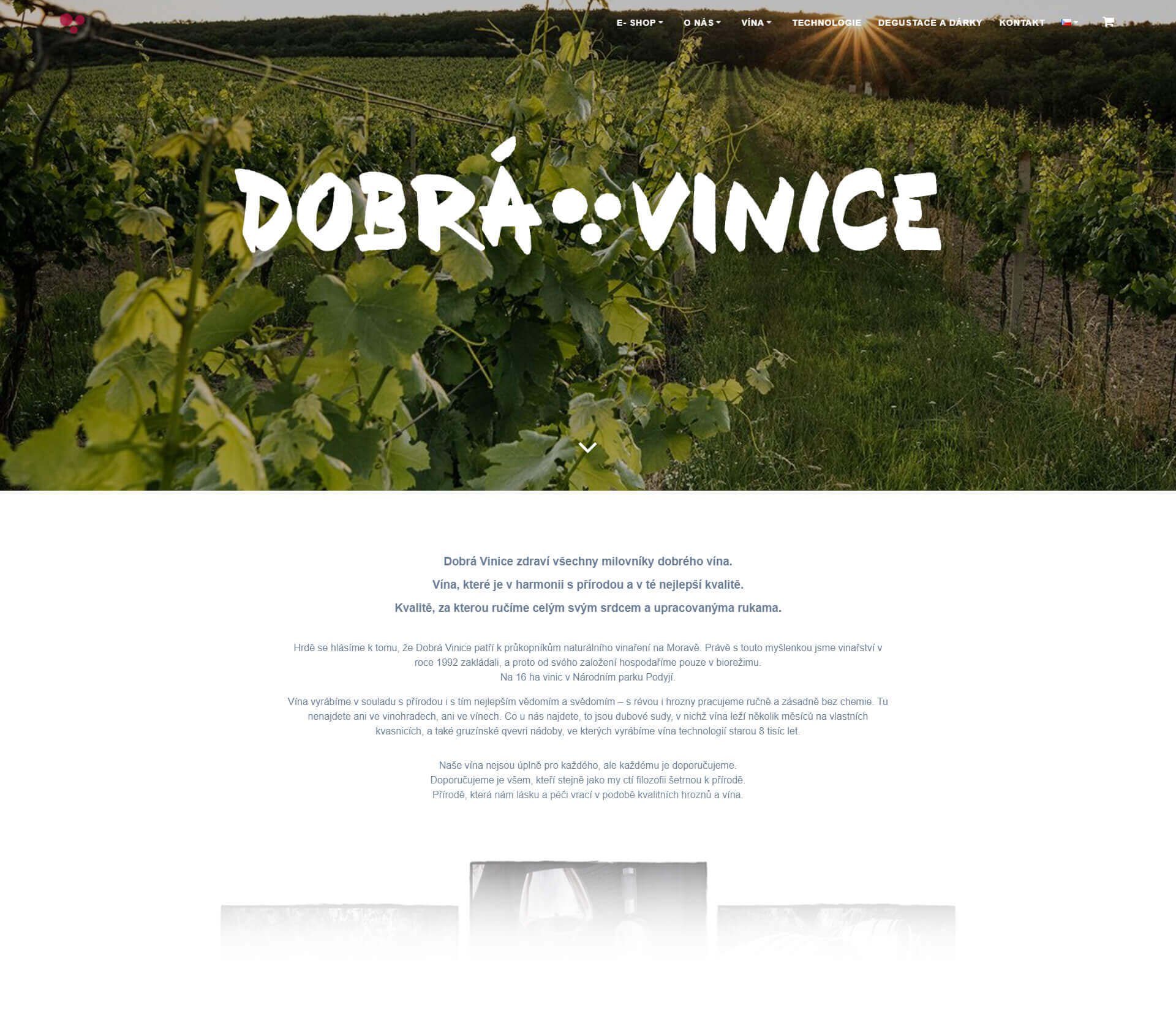
Although the winery supplies its products for many premium restaurants (e.g. the Michelin star Field restaurant), wine shops and wine bars, it hasn’t sold its wines directly via its own e-store so far.
We therefore focused on creating a new modern website with an emphasis on the e-store, where the winery’s turnover is currently up to CZK 350,000 per month. In addition to increasing sales, the new website with an e-store will also help establish and maintain direct contact with the community, e.g. through emailing.
- The average website traffic increased 20x
- The average time spent on the website is almost 5 min
Advertising
The creation of a new website with an e-store allowed the client to better reach the target group. We have created a strategic plan for the implementation of PPC advertising and emailing for Dobra Vinica.
For example, on the 30th anniversary of the winery’s founding, we created an online promotional campaign with a one-day hard sell approach. In one day we managed to reach a turnover of CZK 344,000, which is 76x more than regular results.
We used online advertising, social networks and emailing as communication channels. The whole communication was tied together by visuals from photographs taken directly in the wine cellar.
Conclusion
Doing things your own way with all your heart while respecting wine and nature – these are Dobrá Vinice’s main values, which are now reflected in the brand’s visual identity and communication.


